With digital tendencies and user expectations changing every day, technologies evolve and trends change all the time. Some trends become outdated, while others gain higher ground. It means businesses need to follow the most recent tendencies to gain an edge over the crowd. Why is it important for them? Because there are tons of websites available and customers visit various websites constantly, which means businesses need to attract them, gain their attention and make them stay on their website. One of the ways to succeed in doing that is to build an intuitive and visually appealing web solution. And atlas here comes the question – which digital tendencies to follow!
Designs! Yes, if we take a look at the industry, we’d realize how far we have come with constant innovation and creativity. There’s always more to come with the predictions of what designs will be in tomorrow and experiment with new ideas to take the industry forward.
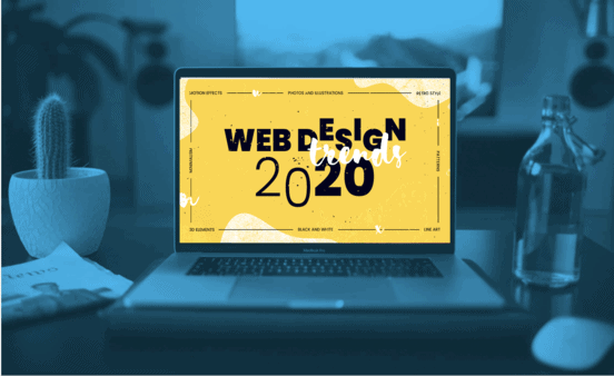
We are going to dive into the complex, unique and well-structured approaches of interface creations and explore the leading UI and UX design trends of 2020 in detail and see how you can implement them successfully!
Contents
- Subtle Animation
- Neumorphism
- Large Images
- Breaking Design Rules
- Variable Fonts
- Bringing Humanity Back
- Branding and Art Direction in UX/UI Design
- Final Thoughts
Subtle Animation
Subtle animations or motions add personality into an otherwise dull and tired web page. They lift the overall look and experience of the interface and make it more fun, delightful and memorable.
Though animation in web design has been around for a long while, they became popular due to .gif and .swf formats. However, it soon became associated with poor UX as a lot of designs were not factoring in usability. Later, CSS3 picked it up and was made the ideal tool for animation – designers have been experimenting with animation in UI ever since!
We’re seeing it more and more in designs in various sectors – finance, healthcare etc.
Subtle animation makes your website look elegant, adds personality to it – for example, having your navigation fade in on load provides for a really nice touch. Small things like that help visitors connect on a personal level, giving them a sense of delight – which makes them like your brand or company more. However, do note that there is a fine line between subtle and too much. Animation can also be annoying to users if not placed right or done on every section of a single loading page. So you need to make sure your animations are appropriate for your audience.
Use simple, straightforward ideas to add fun and dynamism to your webpage. With a customizable HTML template – including landing pages, inner pages, a carousel slider, and CSS3 animation – start testing out what works for you and your audience!
Neumorphism
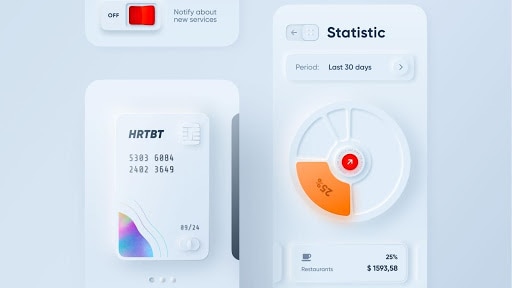
Neumorphism – a style or a trend that has designers tumbling over themselves to make mock-ups in – has gotten plenty of hype. But what is neumorphism?
Neumorphism is just a witty combo of the words “New” and “Skeuomorphism”.
It’s a modern iteration of a style of designing web elements, frames, screens, etc. called as Skeuomorphism – a style to describe design elements that look like their real-life counterparts. The most common example of it could be a recycle-bin icon, that is a bin used for trash, which has the same use in real-life as well.
The trend brings a new feel to the interfaces – its heavy use of soft shadow makes for the design to be both futuristic and realistic. While neumorphism design and the subtle differences in the colour value make it look minimal and aesthetically pleasing, it has a lot of limitations. Due to the low contrast ratio, there is an accessibility issue. Moreover, it is complex and not easy to achieve visual hierarchy by visually differentiating elements based on their importance levels without compromising accessibility.
That being said, designers have been constantly coming up with new design ideas to expand the concept of neumorphism and this trend keeps evolving with time.
Large Images
Images are more than mere decoration, they have a powerful impact on users and can make or break their experience. Human beings process visual information almost instantly and images are a powerful way to capture people’s attention and differentiate your product. A single image can convey more to the user than an elaborate text block and the bigger the image the better!
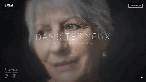
While illustrations are still at the fore of website design, it’s images that work as the main attraction where illustrations are not used. Designers have been using big images cleverly – whether as full, subtle backgrounds or as striking website centrepieces. So in 2020, having some kind of image (or any background video) on your website is a must and the larger it is, the better!
For the background, keep something minimal. For others, test out something more dynamic. But only use relevant images. Your visuals should be high-quality and should not create visual noise. Remember, image-focused designs are not for every page!
Breaking Design Rules
There’s nothing wrong with working the traditional way, under the constraints of UI grids and rules but lately, designers have been experimenting with the designs to make them stand out – by breaking the rules!
In the last year, we have seen a huge trend of asymmetrical grids and layouts emerge in the world of UI design. The idea is to make the website or the layout look less “blocky” and straight-edged. A lot of new elements have come into the light, so much so that it has become a regular trend. Wild fonts that are no as readable, asymmetrical layouts, hand-drawn elements or adding some elements over the top of others to obscure them – this trend is mixed in with emerging aesthetic designs.
Some of the most used designs or layout trends under the unconventional grids are –
- Collapse Gutters – It refers to the spacing between the columns or rows in a grid, which helps the design breathe with structure and consistency. Break the standard grid system – eliminate gutters and margins completely or reduce them significantly!
- Overlay Multiple Elements – Layered imagery, typography and other design elements used to add dimension and character to your layout. Combine large, bold headings with small-sized images or vice versa.
- Embracing Empty Spaces – Not every surface of the area needs to be filled with something. Embrace the large empty white space and guide your users to the focal points of your website and help them navigate through the products more efficiently.
Variable Fonts
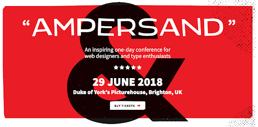
With potential consumer and brand touchpoints ever-increasing, there’s a huge trend of variable fonts. This trend rise was projected despite the fact that many designers are not even fully familiar with what variable fonts are, which is remarkable!
Simply put, a variable font is a single file which has the capability of acting as many. It provides various options and different appearances can be achieved through spacing, weights, and widths of characters, which leads to improved performance and smoother transitions between styles. Variable fonts are allowing brands to achieve what they couldn’t before – design easily and less data to download due to single file!
Although we’d learned about OpenType 1.8 a while ago, variable fonts have just gained the popularity that they deserve. Imagine a single font can be viewed in multiple ways. Adjust the letter size, customize the width, shorten the descenders and all without increasing the size. That’s real flexibility!
So there is every reason to believe that this trend – variable fonts- has a bright future and is totally worthy of your close attention.
Bringing Humanity Back
We have all seen impersonal, “digital” graphics dominate web designs for years, but now the hand-drawn design elements are making their way into the creative world. Hand drawn or more humane design trends are popping throughout the design community – illustrations, icons, fonts, doodled websites and many more like these. These have gained huge popularity in the recent months because users seem to crave emotionally injected designs – adding humanity into websites with its realness!
The world asks for authenticity, which has started to influence the illustration space as well. Adding hand-drawn elements into the website gives it a fun look. The unique style and visually appealing look with these elements not only show off your brand personality and make you stand out from your competitors, but these humane elements can brighten up a user’s day!
Bring humanity back and experiment with hand-drawn elements – use new textures and grain effects as well. It’s rightfully said that hand drawn graphics are coming back with a bang and looking at a pace of their popularity – they are here to stay. Whether it’s icons or illustrations, we will see more and more designers adding purposefully messy-looking elements or designs to their website layouts!
Branding and Art Direction in UX/UI Design
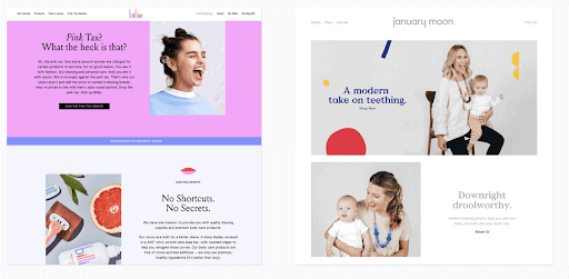
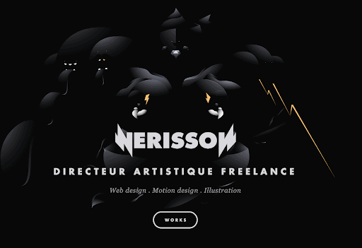
UI and UX designers have been bringing in various elements in designs – imagery, text, colour, interaction – together to create cohesive designs, breaking down the distance between screen and customer. And these creative skills don’t necessarily come from those with tech backgrounds. Artists and designers who have not worked in tech before have unique and valuable approaches which they contribute to creating different layout styles, pushing the boundaries!
Make sure the elements in the designs belong there, instead of trying to make them similar to others and try to fit. A brand is a touchpoint which shouldn’t be deviated from – its colour, type and imagery standards should be kept in check.
The art of direction – selecting the best way to communicate your brand or message with the panel of tools: colours, words, layouts, images and typography. Creating the right mix of these elements is a must in order to suscitate emotions through your website. Further, art direction will also make people better understand your content, perceive moods, get the brand’s virtual identity and feel for the brand!
One thing is clear when it comes to UI and UX design, the most important thing is to be cohesive, distinctive and to keep evolving!
Final Words
The technological ecosystem always influences the ux/ui trends and this year’s trends prioritize speed, simple yet fun page designs – UI/UX designers need to work with creativity and innovation, keeping up-to-date with the latest trends and adapt to them accordingly.
Companies or brands that go on to building wholesome and well-thought products with an aim to better user-experience will yield a greater ROI in the whole process. Meanwhile, those who are slow in adopting these changes or trends will find themselves lagging in the market competition in the coming decade.
aTeam can help you create an innovative and highly responsive website and help you elevate your business!
Our experts would be happy to discuss your current challenges and assist with UX/UI strategy and design.
With a team of experts and resources, aTeam Soft Solutions extends a hand for helping you take your brand to another level. Reach a bigger customer base, increase your revenue, gain success with the right development partner.
Our team looks forward to serving and helping you achieve your business objectives.
Talk to our expert today!
Contact us at [email protected]
Reach our team to have a discussion about your requirements and let us build something great together.
